Distinctive product branding
Archer
2023
Archer is a global company providing drilling and well services to the global energy industry. Archer wanted a distinctive visual identity for their VIVID® acoustic listening platform. We created a striking design and clear message which stood out but clearly connected to the Archer identity.
Brief
Their newest offering, VIVID® initially had a less mature and connected visual identity, in comparison to the others, and the Archer team recognised that it needed to be brought in line with the other proprietary technology brands.
The goal was to create a clearly defined and differentiated brand platform, keeping it within the Archer brand framework while also allowing it an element of individuality.
We held a discovery session with the Archer Wireline team to understand the unique benefits and application of VIVID® technology. From this we gained the insight needed to evolve and focus VIVID®’s brand.
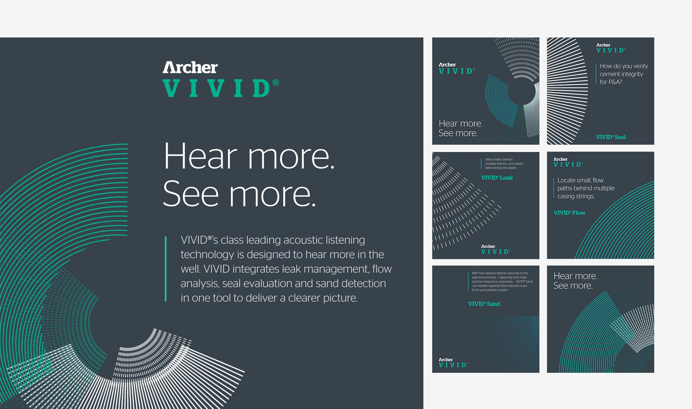
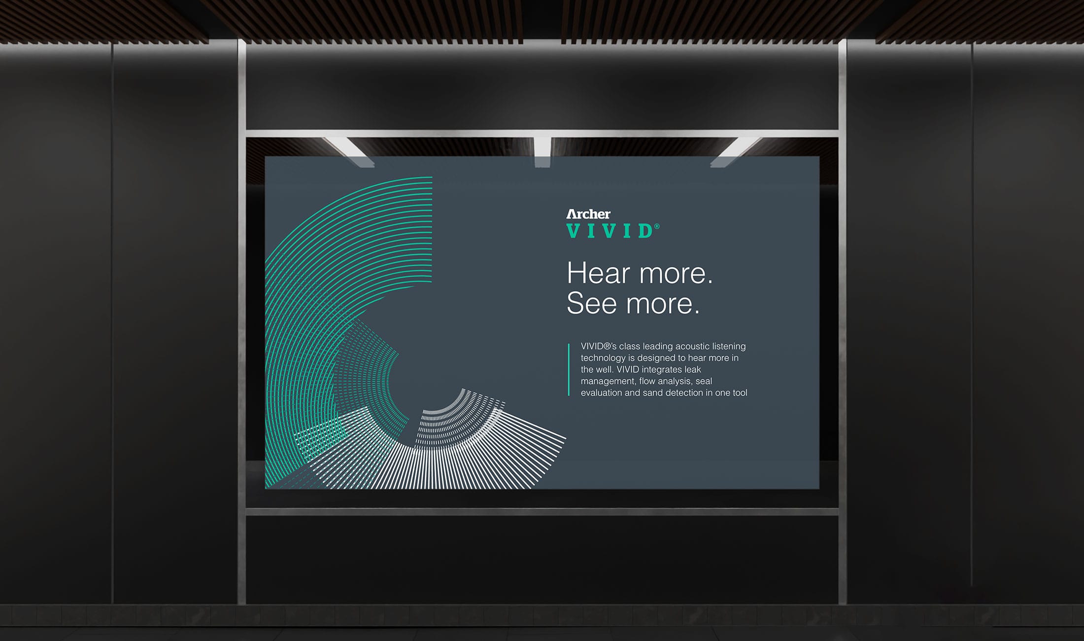
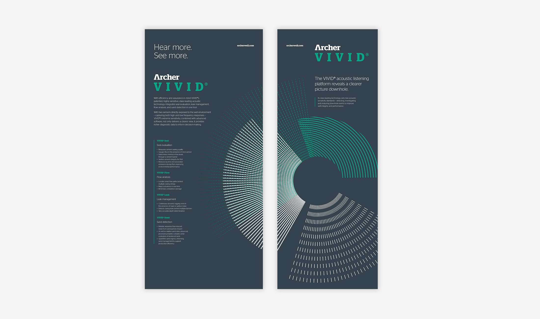
This process started with defining the brand positioning. Working alongside Paddy Sutton, we created 3 positioning options for the Archer team to consider. Each option was based on a core aspect of the VIVID® offering. From these options the team selected “hear more, see more” which is a positioning orientated on the experience the client has – VIVID® technology hears more so they see more, enabling them to optimise well production.
This was then adopted as a tag line for VIVID®, with clear values and wider messaging created to reinforce and build the wider message.
Once the messaging was defined, we worked in collaboration with Creative Director Ian Haughton, who used the messaging as the creative hook to develop a distinct visual identity for VIVID®. The identity needed to be positive and active while also conveying clarity and confidence. Critically the visual identity also had to integrate into the wider Archer brand, using the core brand framework.
The client was presented with 2 initial options for consideration. On review the Archer team requested that the colour green be dominant within the design. As a result, we created new design concepts with a green dominance. From these options they selected their preferred route.
A clear product brand framework for VIVID® was created. The messaging leads with the universal benefit and becomes more granular as the messaging unfolds. Complex terminology is limited where possible.
“Hear more, see more” was then brought to life with a distinctive design. The VIVID® pattern is a key element of the identity as it graphically represents the four types of sensors emanating out from the circular wellbore. The pattern can be used in different ways to bring life and movement to the designs.
With the messaging and identity finalised we then helped the Archer team develop the initial launch material needed to get the new VIVID® brand out there. This included:
- VIVID® brand guidelines
- Logo and patter files
- Case study template
- Master PowerPoint template
- Exhibition banner stands
- A launch presentation
- Website banner
- LinkedIn content & images

- Brand strategy
- Messaging
- Visual identity
- Product marketing
- Template design