Keystone brand evolution
Keystone
2025
Keystone brand evolution tells the story of how we helped a leading energy software company strengthen its presence and modernise its identity. Keystone provides critical energy software that supports the planning and execution of complex well construction projects. Trusted by global energy leaders, their tools help teams make smarter, faster decisions in high-stakes offshore environments.
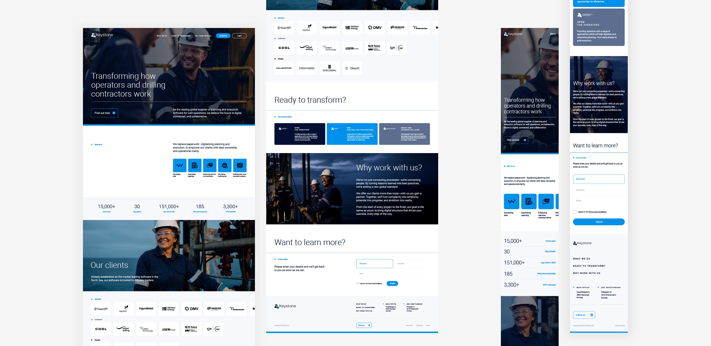
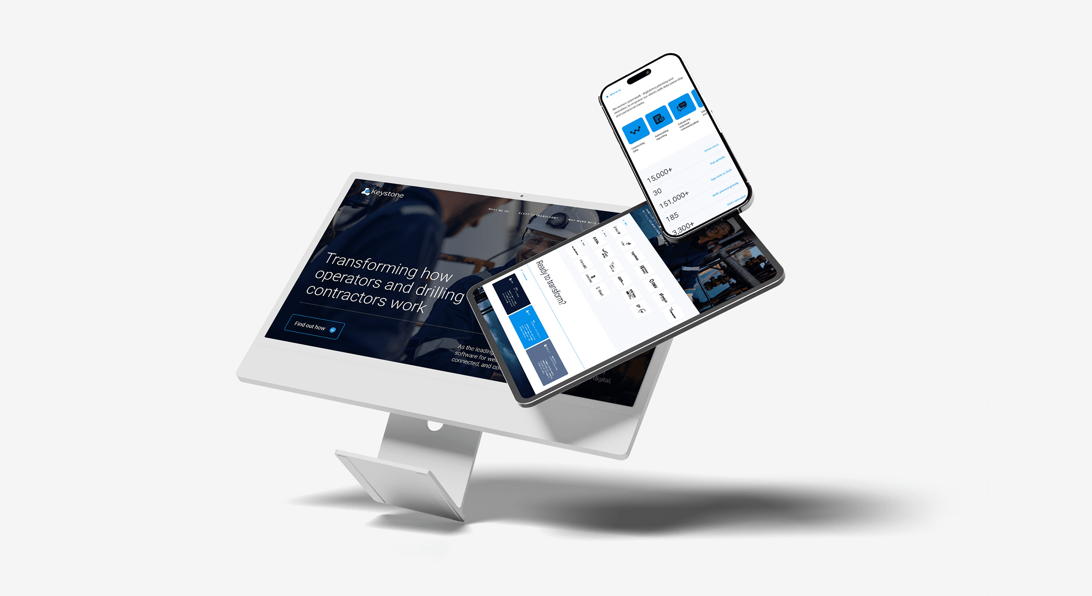
We evolved the Keystone brand to reflect that reputation — refining the logo, updating the colour palette, refreshing the messaging, and launching a new one-page website. The result is a confident, cohesive identity that matches the quality of the product and the ambition of the business, strengthening Keystone’s position in the energy technology sector.
Brief
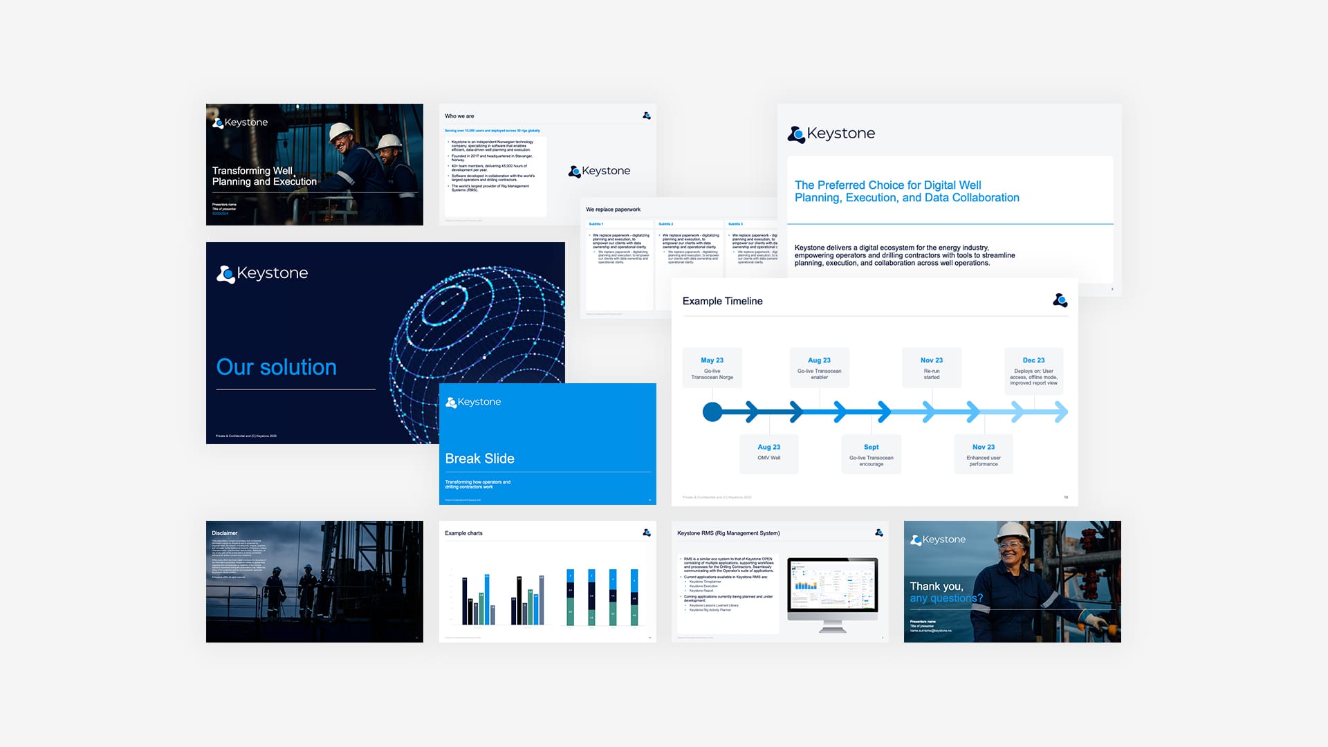
Our process began with discovery, engaging with Keystone’s leadership, auditing existing materials, and analysing competitors. From these insights, we created a focused plan to evolve the brand without losing its essence.
We developed a clear messaging framework anchored in a single, compelling narrative. This became the foundation for all communications and guided the design and copy for the new one-page website.
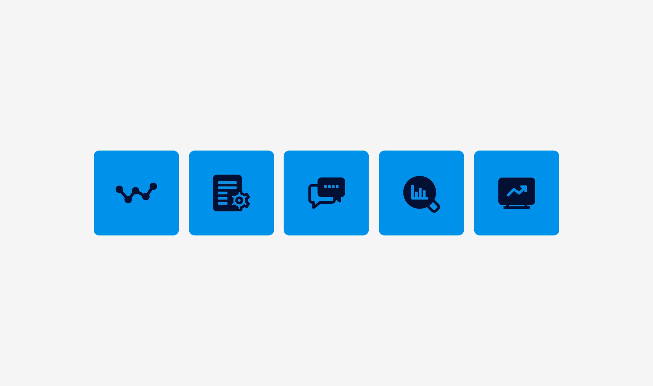
Visually, we introduced subtle yet effective refinements:
-
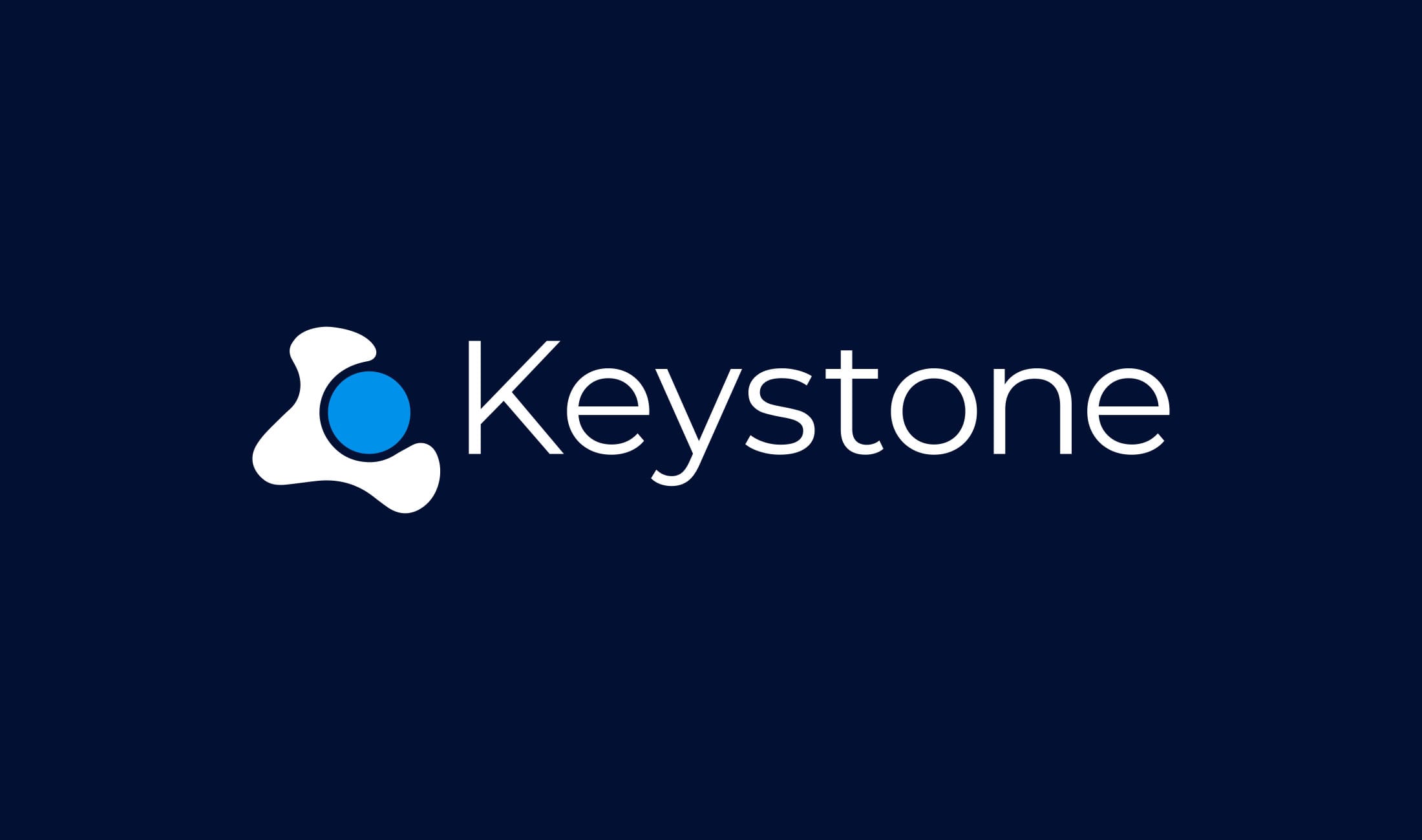
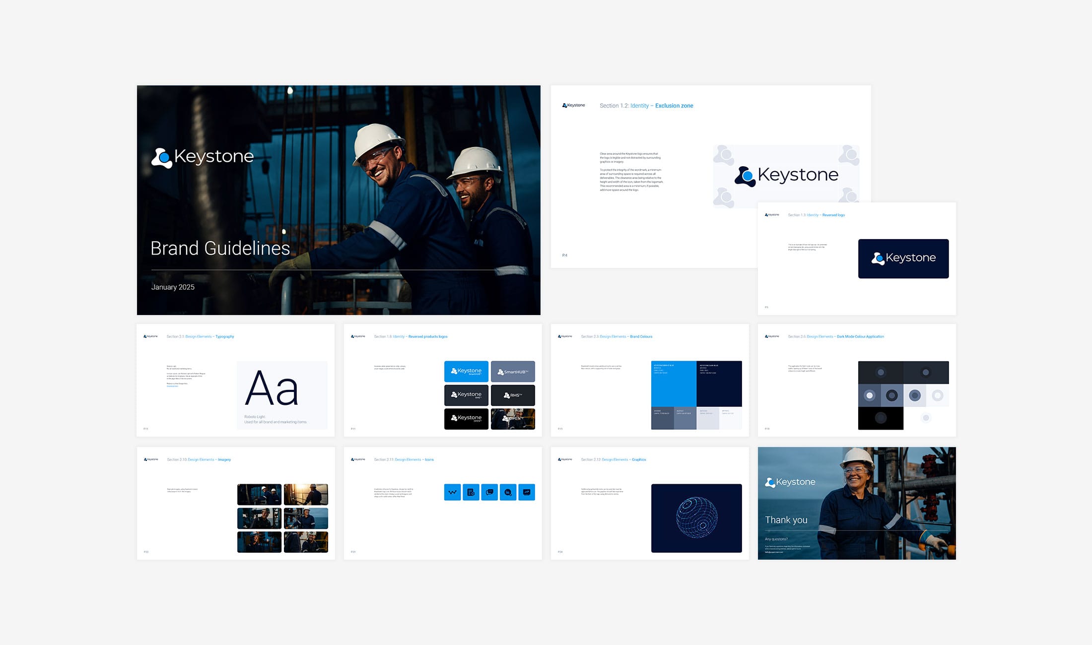
A cleaner, more balanced logo for better digital legibility.
-
A refreshed, screen-optimised colour palette inspired by Keystone’s product interface.
-
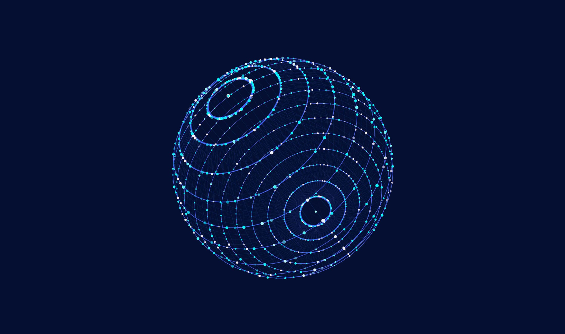
Rounded design elements that echo the logomark and bring visual cohesion.
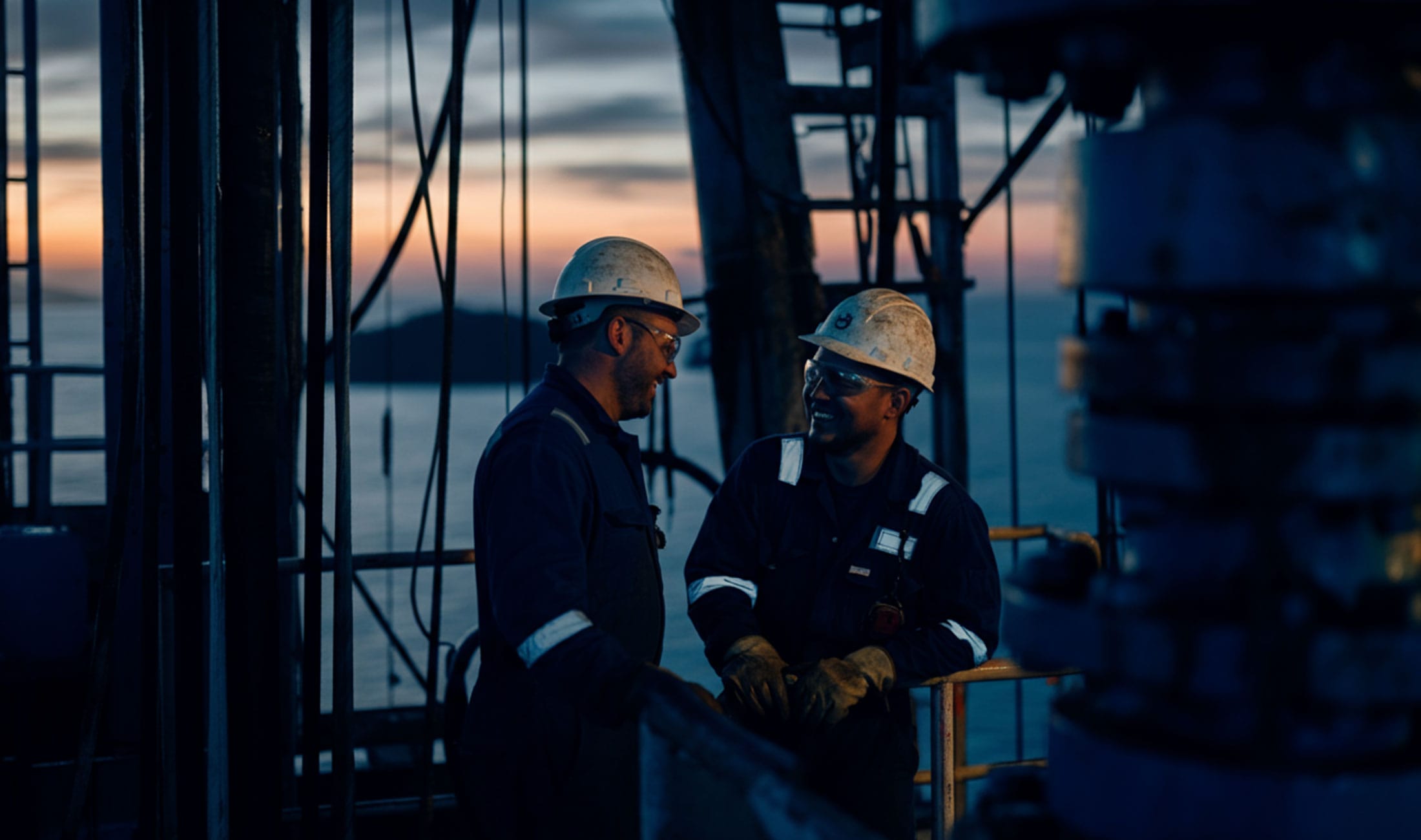
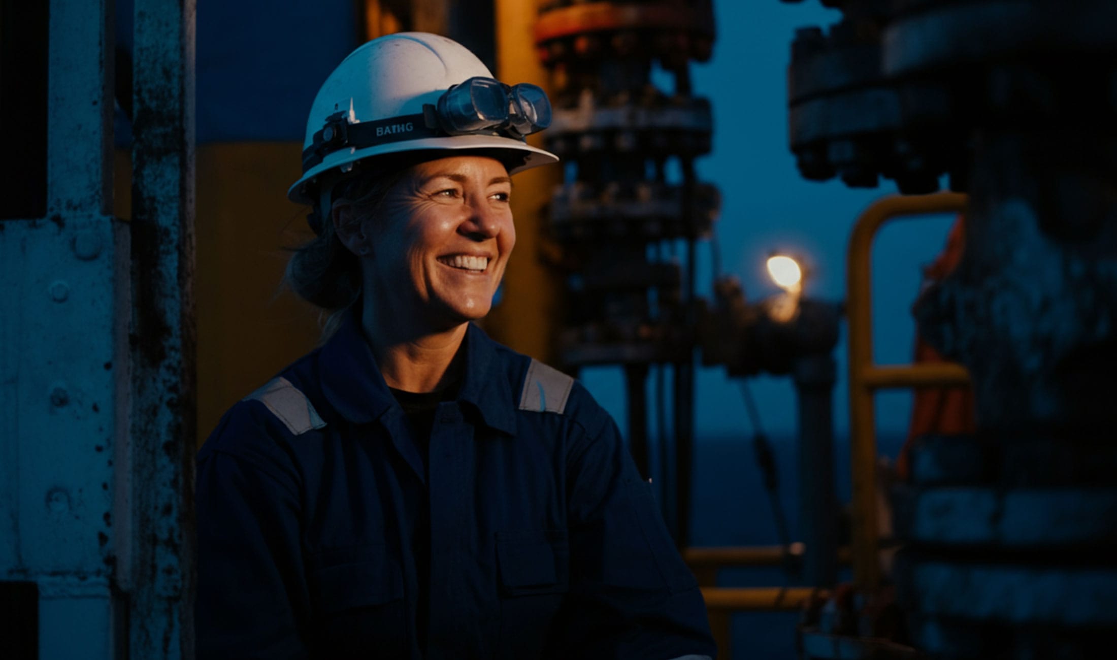
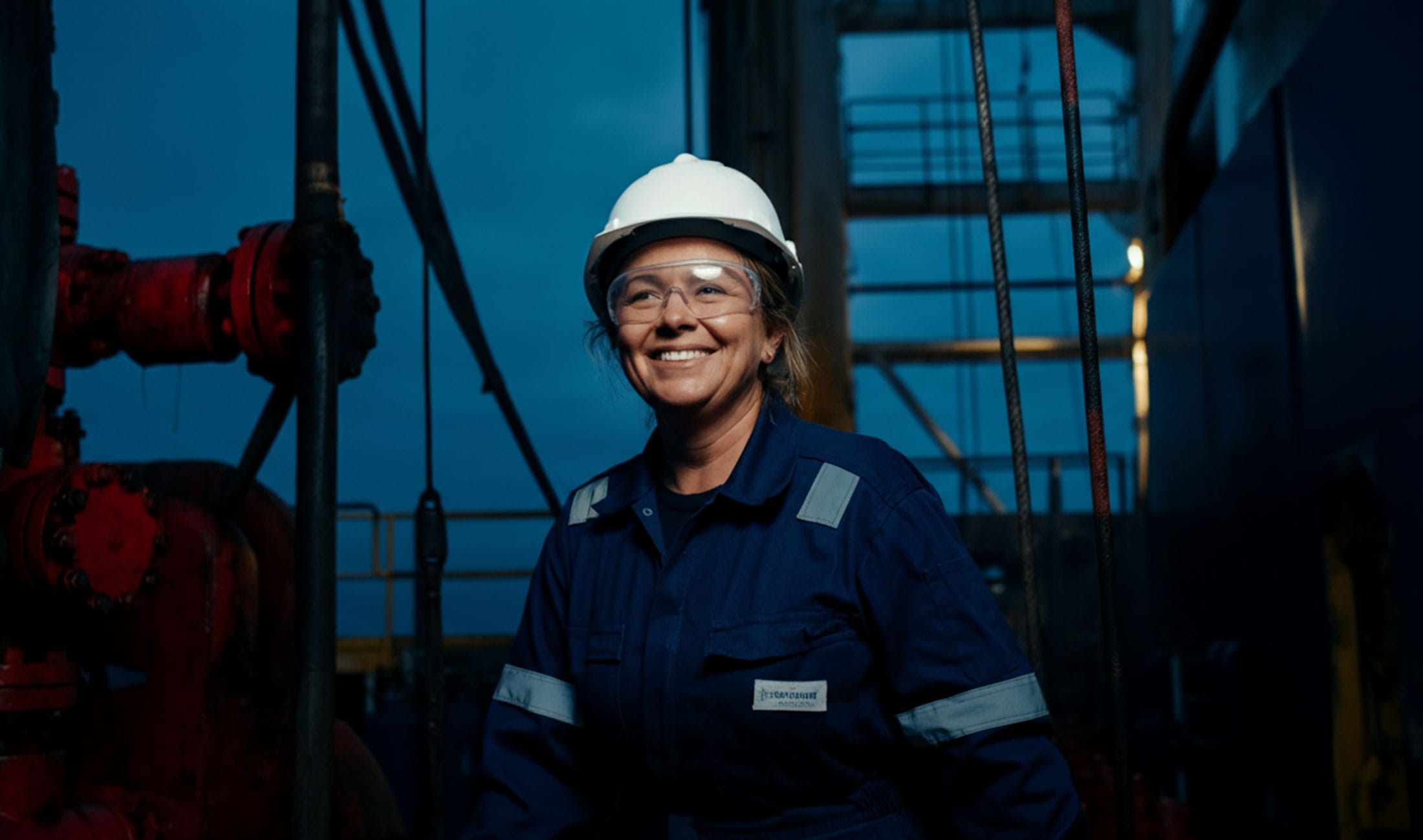
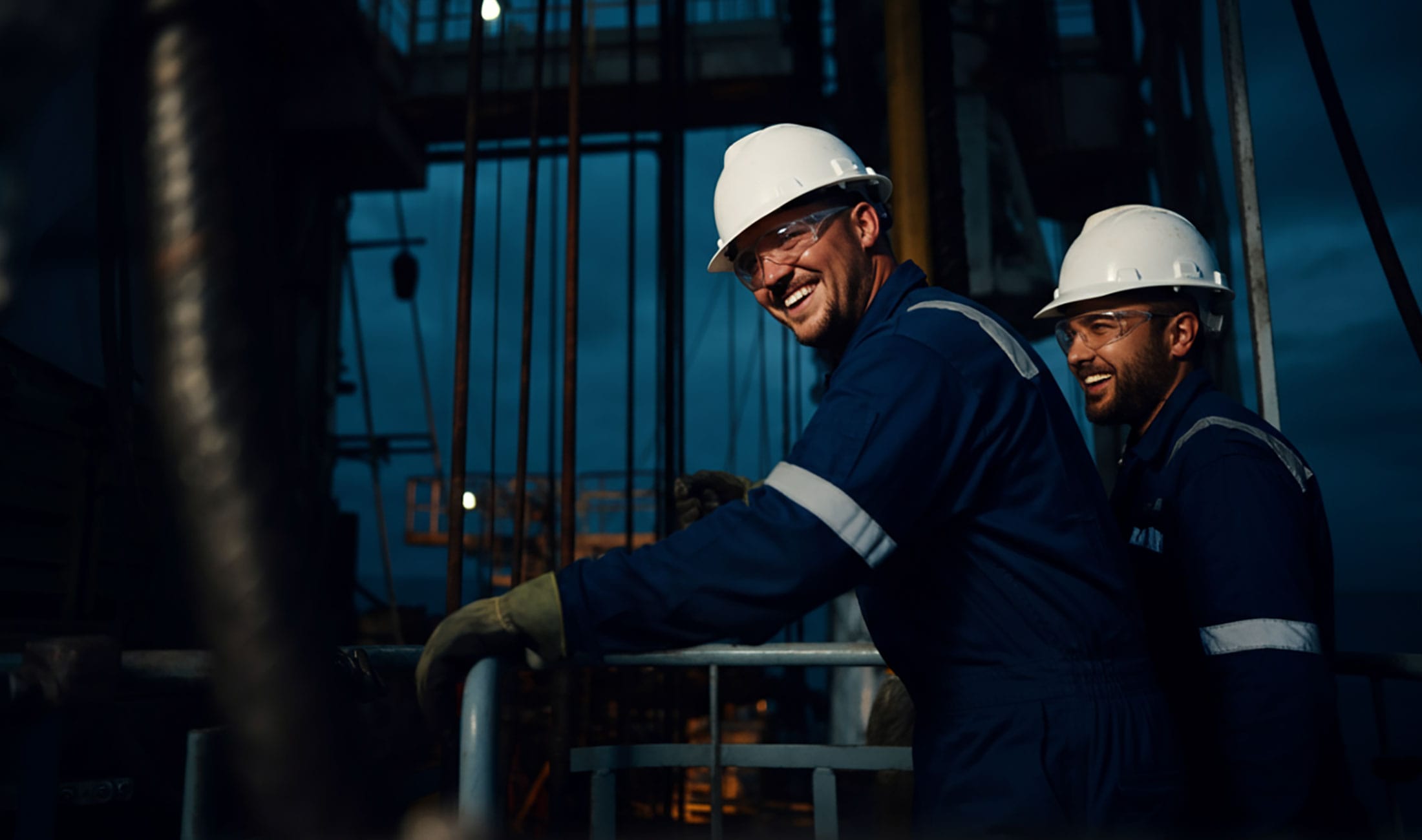
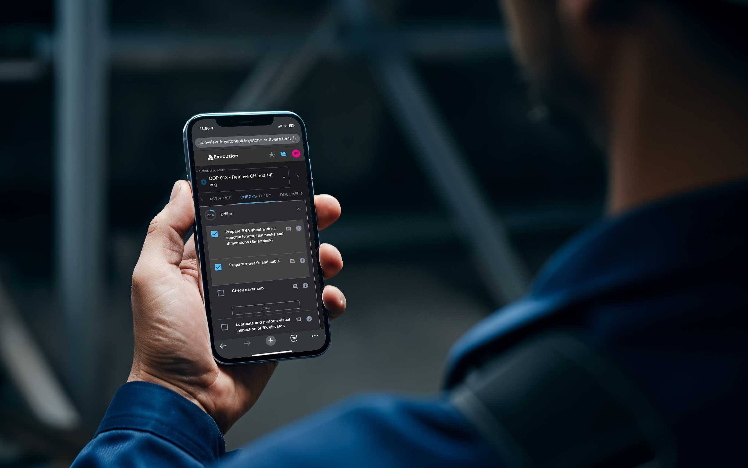
To address the challenge of offshore imagery, we produced a custom library of AI-generated visuals that accurately represent real-world project scenarios, consistent in style, quality, and realism.
This strategic brand evolution project strengthened Keystone’s digital presence and positioned them as a trusted partner for energy operators seeking reliable, data-driven solutions.
Keystone now has a brand that works harder for the business. The new website delivers a clear, confident introduction, while the refined messaging and visuals communicate credibility and technical excellence.
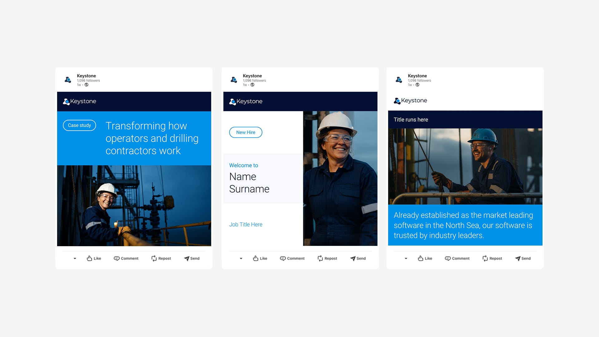
The refreshed identity is already in use across LinkedIn campaigns, sales presentations, and industry events, giving the team a unified and professional toolkit that strengthens their visibility and supports business development in the global energy and offshore software market.
Brand review and competitor analysis
Messaging framework and copywriting
Logo refinement and visual identity update
Colour palette optimisation for digital use
Website planning, design and development
AI-generated offshore imagery
Templates for LinkedIn, presentations, and business cards
Event materials including banners and logo kits
“We knew our brand needed a refresh, but we didn’t want to lose the identity we’d built over the years. Project Neon struck the right balance – modernising our look, sharpening our message, and delivering tools we could use straight away. The new website and assets have helped us present Keystone with more clarity and confidence across every channel.”